Telko Manager® analyzes the main performance characteristics of GSM/UMTS/LTE radio access networks to detect degradations, anomalies, changes and more:
Accessibility
Congestion
Traffic
Throughput
Call drops
Mobility
Unavailability
Coverage
Interference
Detection and monitoring of new cells
Detection and monitoring of nodes being rehomed
Network performance and trends
BSCs and RNCs current performance and trends

Telko Manager® is equipped with Machine Learning and proprietary algorithms to thoroughly scan your network and detect even the smallest performance issues.
The most basic, yet difficult task when analyzing thousands of cells is to isolate sustained and significant degradations considering the large number of glitches found in KPIs due to user mobility (i.e. sudden changes in received signal), traffic spikes, transmission problems, power unstability, among others. Our algorithms use adaptive thresholds, both in amplitude and duration, to reduce the number of false positives and report cells that are likely to have a performance degradation.
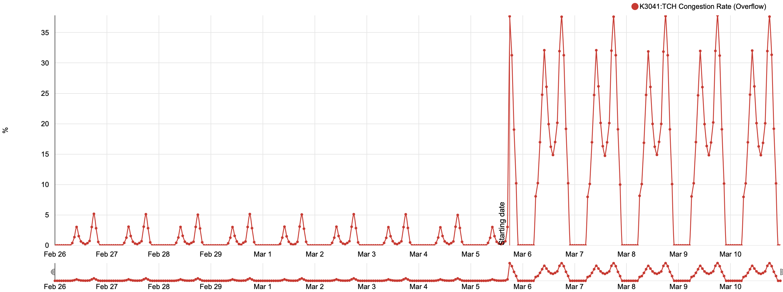
The same algorithms used for accessibility can be modified to find cells with high congestion or excessive call drops. The detection process starts as soon as new hourly KPIs are generated; therefore, Telko Manager® lets you know at any given time which cells in your network are the worst offenders to its performance.
Our Machine Learning algorithms are able to estimate the expected levels of traffic and throughput at any hour during the week. For instance, they know the difference in traffic between Mondays and Sundays (or the variation in throughput between day and night) for each cell in the network in order to avoid false positives. The same algorithms can be adapted to detect changes in coverage or the presence of interference (e.g. RTWP changes). Telko Manager® effectively saves you from numerous cases of revenue loss and reduced quality of service.
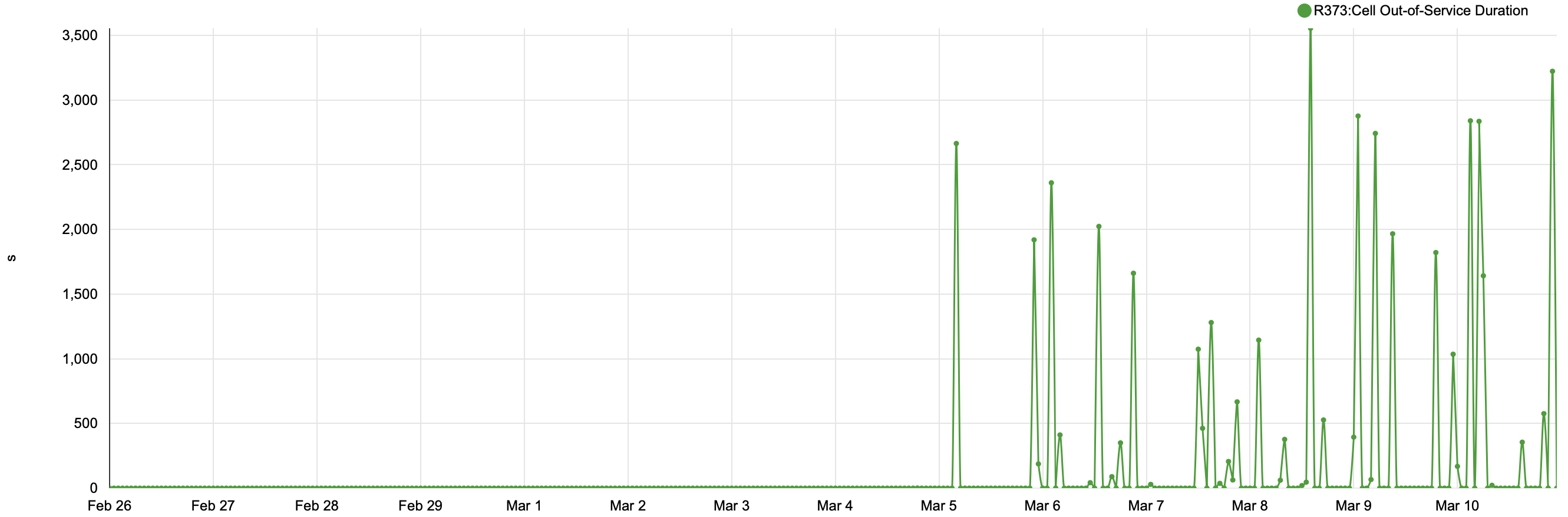
There are three types of unavailability issues that can be detected with Telko Manager®: cells that are currently down, random short power outages, and cells that are not reporting KPIs due to some anomaly. All of these problems require a specific algorithm for each purpose. For example, the figure above depicts a typical pattern of power unstability in which a base station randomly turns off for a few seconds up to several minutes a day.
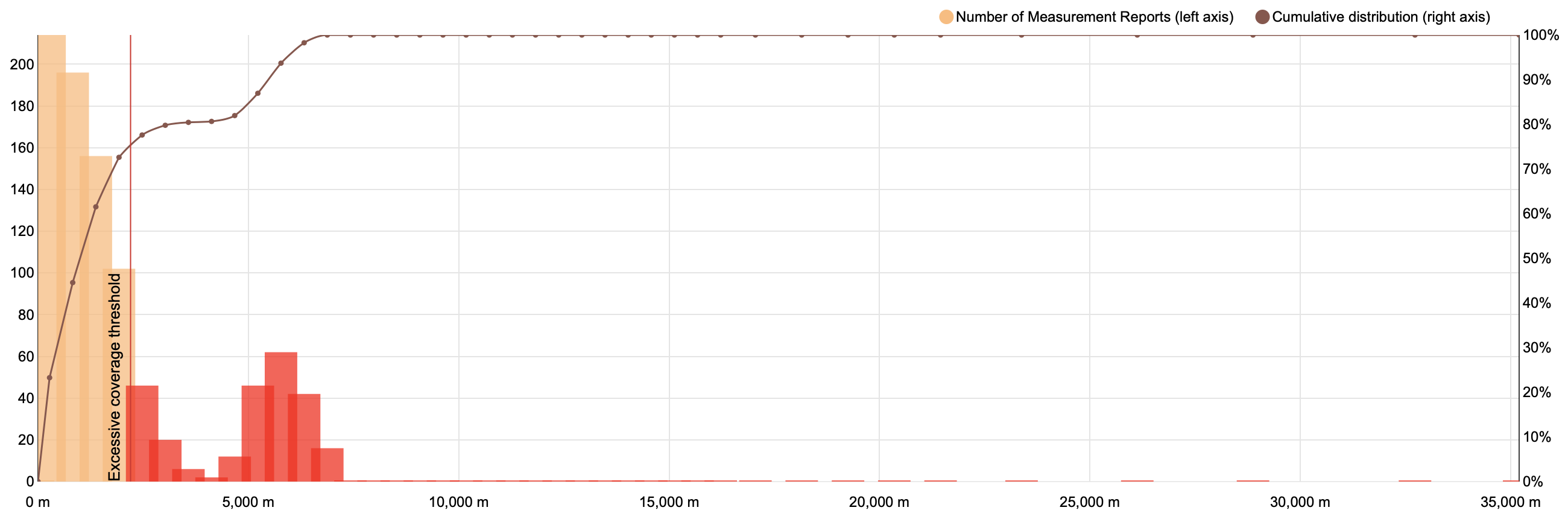
Assuming a cell is at 0 meters, this graphic shows the number of daily measurement reports from cell phones at progressively farther distances. As you can see, most reports are close to the antena (in orange), but some of them are grouped far from the cell (in red). The latter are considered excessive coverage (a.k.a overshooting) and cause call drops and low throughput due to weak signal power. We devised a configurable algorithm to detect these cases which allows you to set a threshold distance from where you consider coverage overshooting.
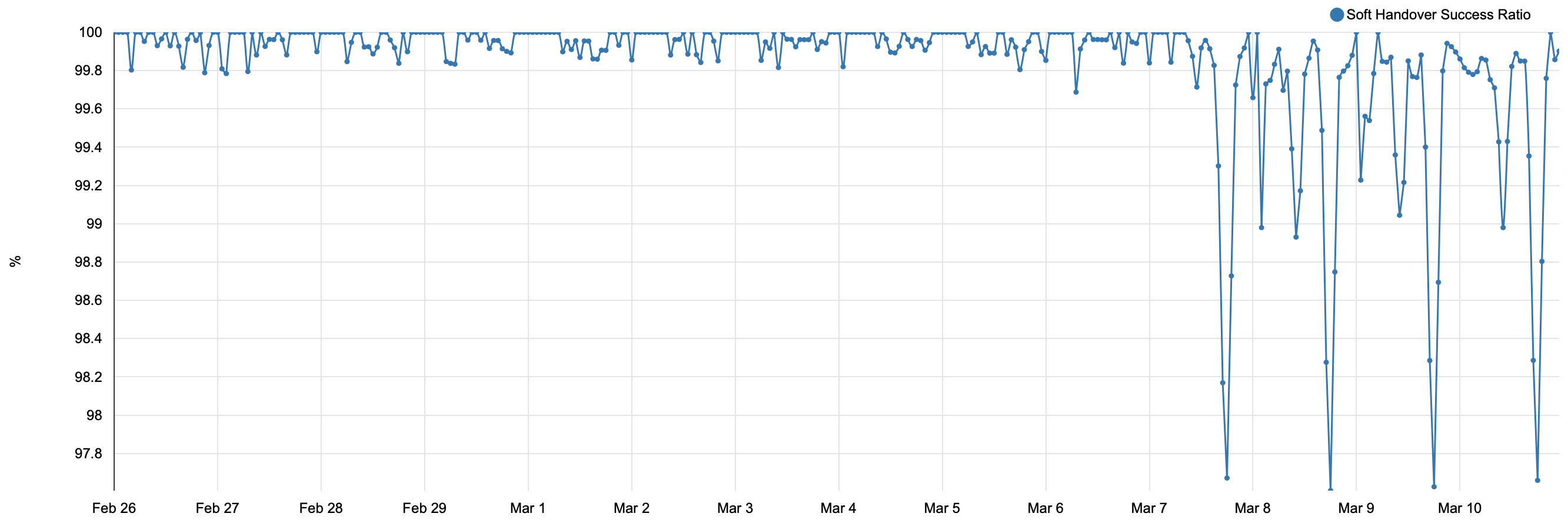
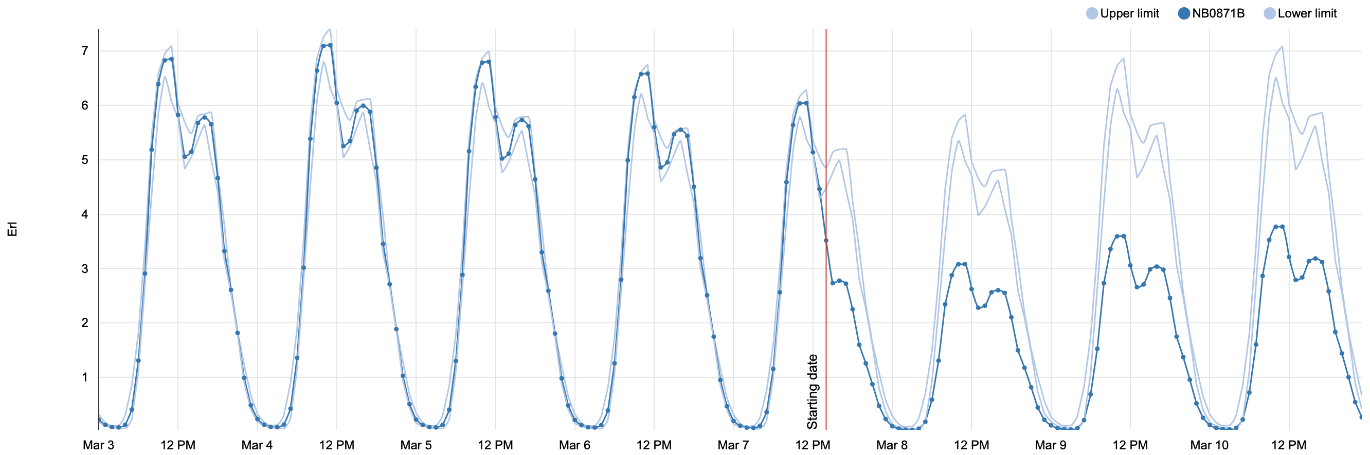
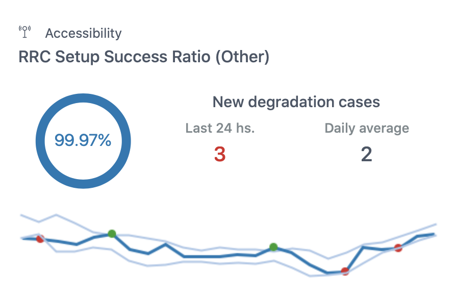
Every hour Telko Manager® aggregates measurements from all cells into radio access network KPIs that are processed by a statistical learning algorithm to calculate a range of expected values.
Whenever an hourly measurement is too high or too low, the algorithm indicates that anomaly with a dot on the KPI curve. If the measurement represents a degradation, the dot will be red; conversely, if the measurement turns out to be a sudden improvement in performance, the dot will be green. Visual cues like this expedite monitoring tasks.
Every hour Telko Manager® aggregates measurements from all cells into radio access network KPIs that are processed by a statistical learning algorithm to calculate a range of expected values.
Every hour Telko Manager® aggregates measurements from all cells into radio access network KPIs that are processed by a statistical learning algorithm to calculate a range of expected values.
Whenever an hourly measurement is too high or too low, the algorithm indicates that anomaly with a dot on the KPI curve. If the measurement represents a degradation, the dot will be red; conversely, if the measurement turns out to be a sudden improvement in performance, the dot will be green. Visual cues like this expedite monitoring tasks.
Whenever an hourly measurement is too high or too low, the algorithm indicates that anomaly with a dot on the KPI curve. If the measurement represents a degradation, the dot will be red; conversely, if the measurement turns out to be a sudden improvement in performance, the dot will be green. Visual cues like this expedite monitoring tasks.
In addition, Telko Manager® provides a comparison between the number of cases detected in the past 24 hours versus the daily average which allows you to quickly spot an abnormal increment of issues due to a major event in the network. Finally, the big circled 99.97% and its blue color are indicating that the network is currently operating normally regarding this KPI; if red or green colors are used, the network is performing worse or better than usual, respectively.
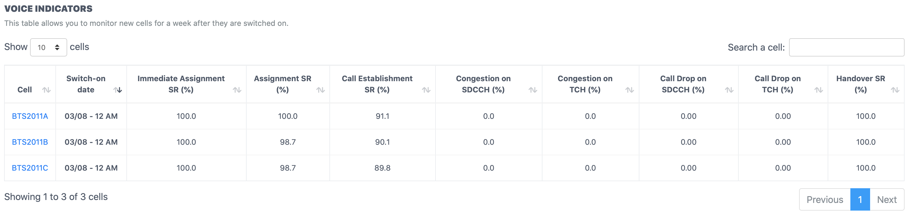
When monitoring a big network, NOC engineers are sometimes not aware of each and every new cell being integrated or which nodes are rehomed overnight. Telko Manager® incorporates an algorithm that detects those cells and facilitates monitoring their main KPIs for a week.
We designed Telko Manager® to provide an incredible experience to engineers that will use it on a daily basis.
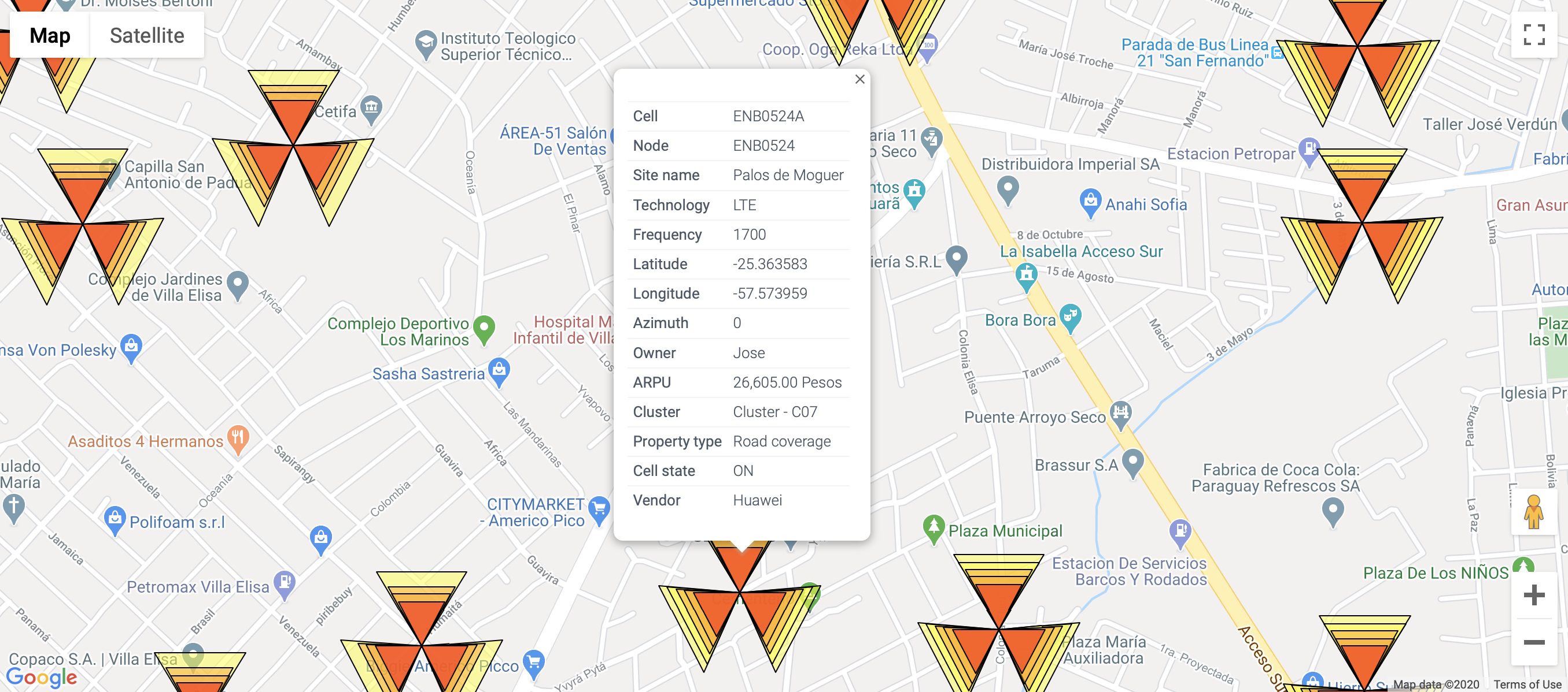
Smoothly navigate thousands of nodes from different technologies (GSM:yellow, UMTS:orange, LTE:red), use a search box to find a cell on the map, click on any cell to check its network parameters, measure distance or drop a marker representing a future antenna or a user.
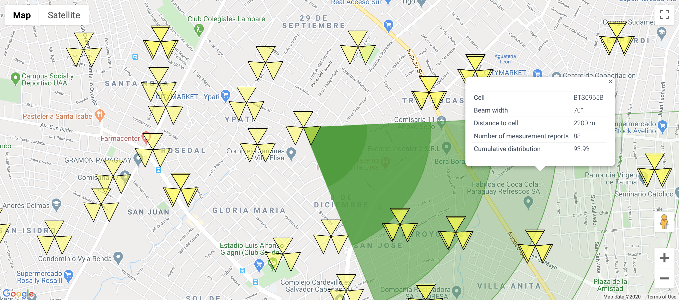
You can draw a cell coverage approximately by using its KPIs and network parameters (azimuth, beam width) at any given hour. For instance, the graphic shown above was built using measurement reports taken at 10 AM which indicate the timing advance (TA) of all users in a GSM cell. LTE also uses TA to estimate distance between mobile phones and cells; whereas, UMTS employs propagation delay values. This feature has several applications; for example, you can estimate cell radius, assess if there is coverage at a certain location, check if a UMTS cell undergoes a coverage reduction during busy hours (due to a phenomenon called cell breathing), among others.
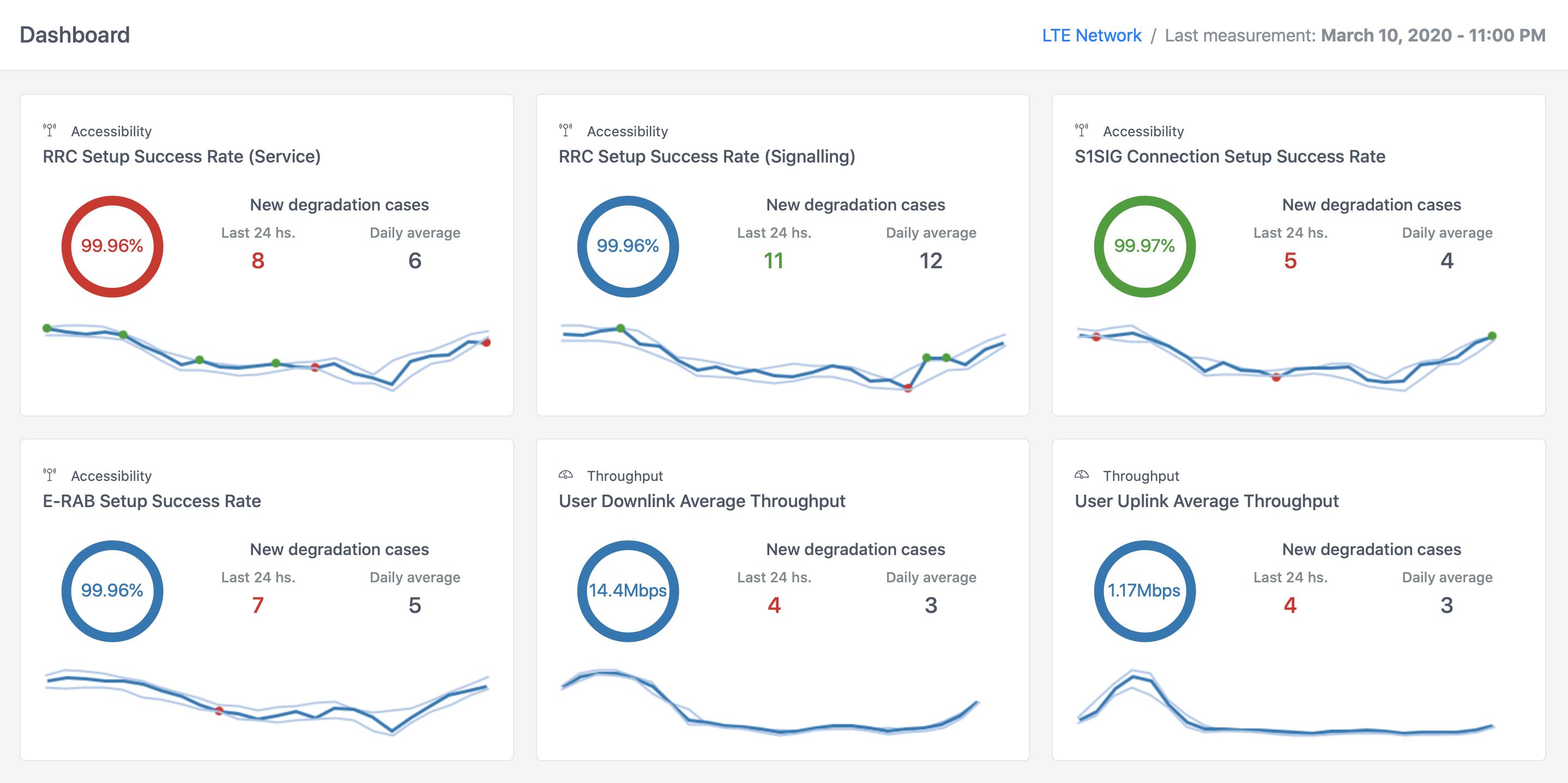
The user interface incorporates a dashboard for each technology containing the main network performance indicators. Each KPI is represented using visual cues that allows you to quickly assess network current status and identify any increase in degradation cases.
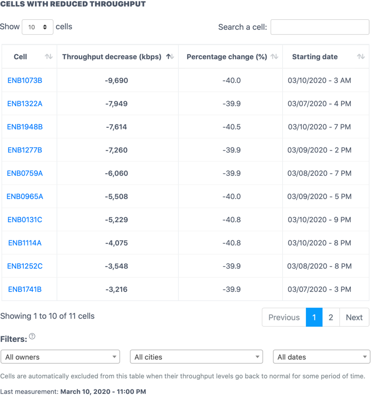
When an algorithm detects the worst performing cells regarding one KPI (e.g. throughput), it saves those cells in a table. The user interface provides filtering capabilities that an engineer can take advantage of to sort the table on the fly according to his criteria. For instance, he can order cells by absolute or percentage degradation (i.e. prioritize cells with the highest throughput loss among all cells or, put first cells with the highest percentage reduction in throughput with respect to their expected values).
There are also filters to display only cells owned by a certain engineer and/or, located at a given city and/or, detected recently or more than two weeks ago.
Also, note that cells whose performance issue has been solved after some adjustments or even by itself (in case of temporary degradations, such as those registered at concerts or special events) are deleted automatically from the table after some reasonable period of time.
When an algorithm detects the worst performing cells regarding one KPI (e.g. throughput), it saves those cells in a table. The user interface provides filtering capabilities that an engineer can take advantage of to sort the table on the fly according to his criteria. For instance, he can order cells by absolute or percentage degradation (i.e. prioritize cells with the highest throughput loss among all cells or, put first cells with the highest percentage reduction in throughput with respect to their expected values).
There are also filters to display only cells owned by a certain engineer and/or, located at a given city and/or, detected recently or more than two weeks ago.
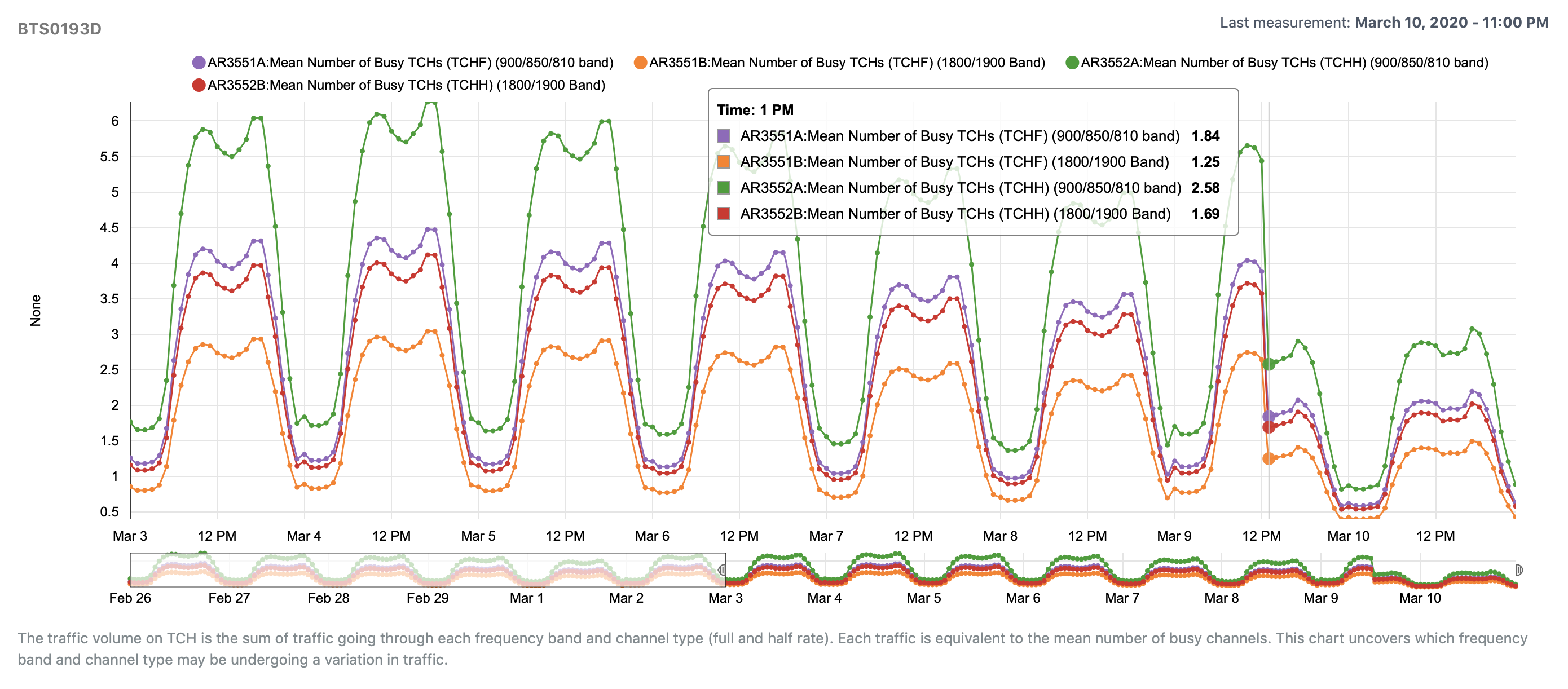
Telko Manager® not only tells you which cell may have a performance issue, but also helps you identify what the degradation causes are. This is achieved by loading several graphics with related indicators and sub-KPIs. For example, when analyzing a GSM cell with traffic loss, many graphics are created automatically. One of those is the figure above showing that the decrease in traffic is affecting all frequency bands. Additional graphics may reveal a reduction in coverage or TRX unavailability causing this problem.
When doing root cause analysis, you can obtain useful information with one click. For instance, you can take a look at a KPI formula and see which sub-KPIs may be affecting a cell performance. Additionally, you can check a cell profile to learn its network parameters, daily traffic and average revenue per user (ARPU). Also, traffic percentile is reported to understand how important a cell is compared to others. For example, a 90% percentile means that a cell has more traffic volume than 90% of cells in the network.
This data will help you further prioritize cells with similar performance degradation based on traffic volume and revenue before starting an optimization task or scheduling a repair.
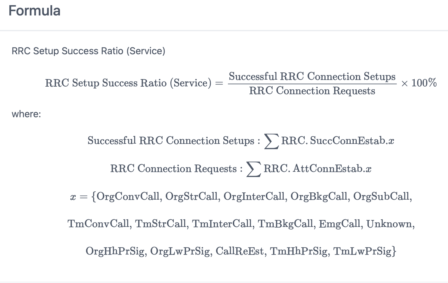
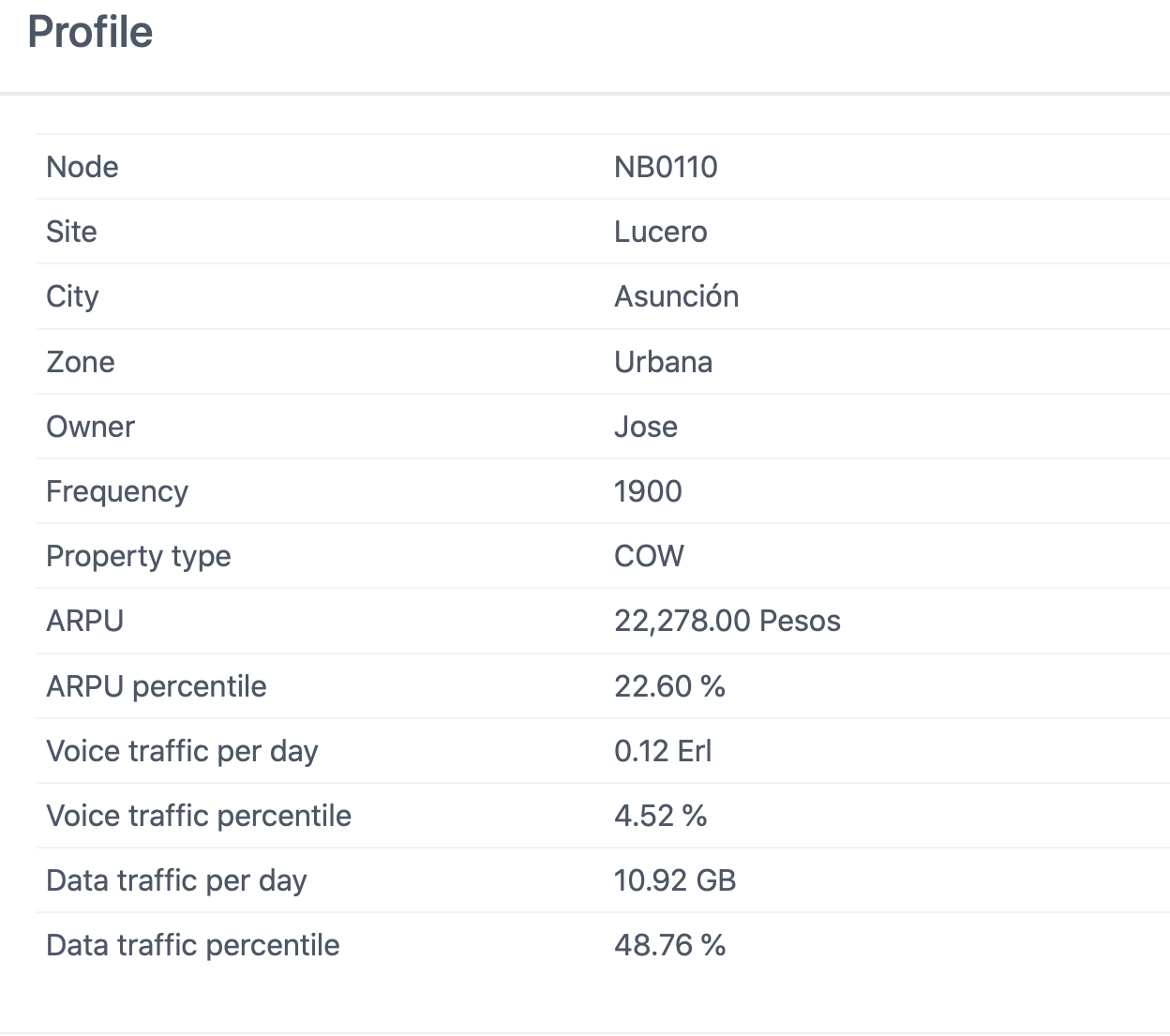
When doing root cause analysis, you can obtain useful information with one click. For instance, you can take a look at a KPI formula and see which sub-KPIs may be affecting a cell performance. Additionally, you can check a cell profile to learn its network parameters, daily traffic and average revenue per user (ARPU). Also, traffic percentile is reported to understand how important a cell is compared to others. For example, a 90% percentile means that a cell has more traffic volume than 90% of cells in the network.
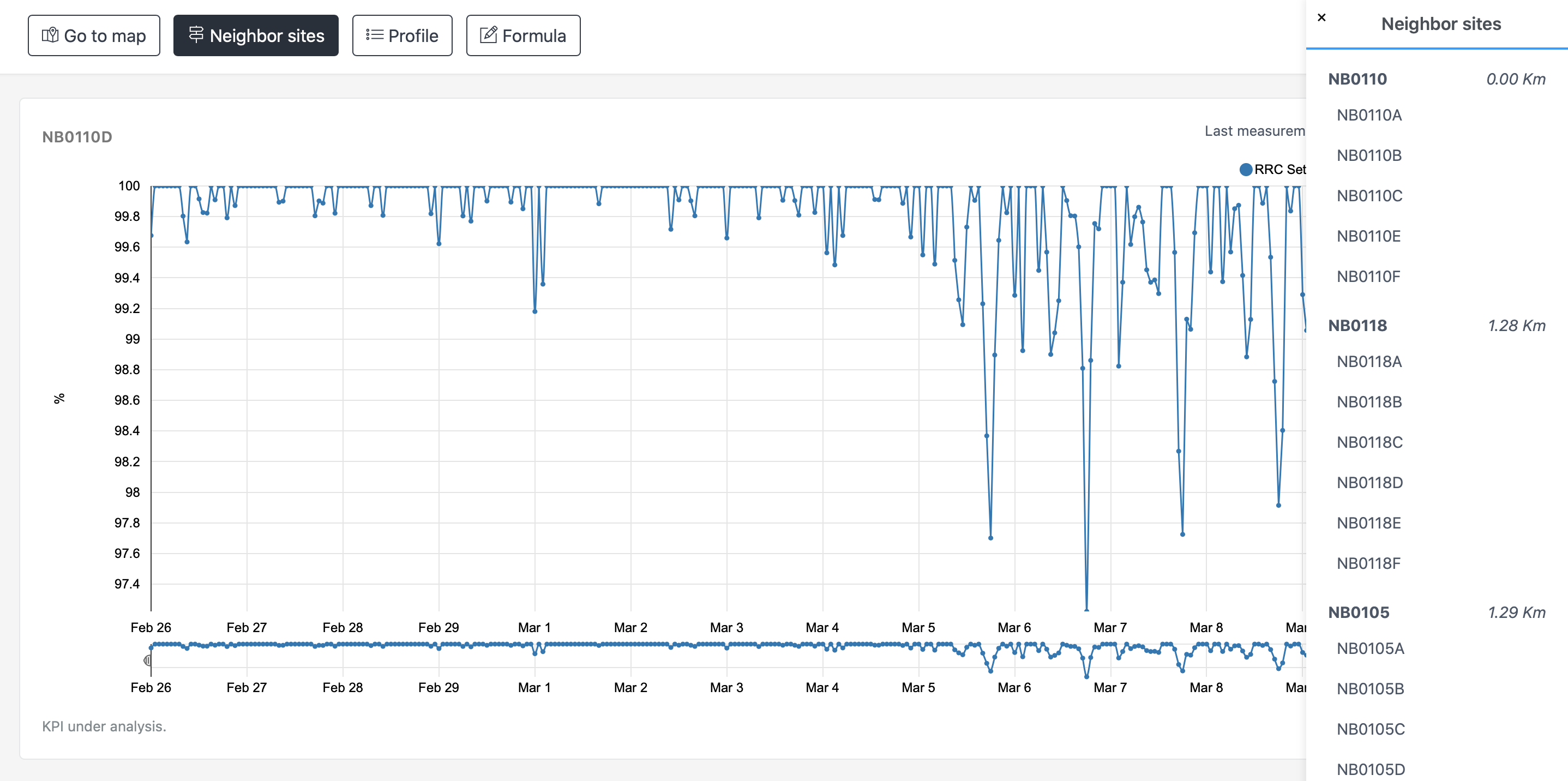
Telko Manager® can calculate and display a list of neighbors whenever you suspect another cell, in the same node or in a neighbor site, may be also affected by a performance degradation. This will save you a considerable amount of time since you can check neighbor cells KPIs with just a few clicks and quickly evaluate the magnitude of a problem.
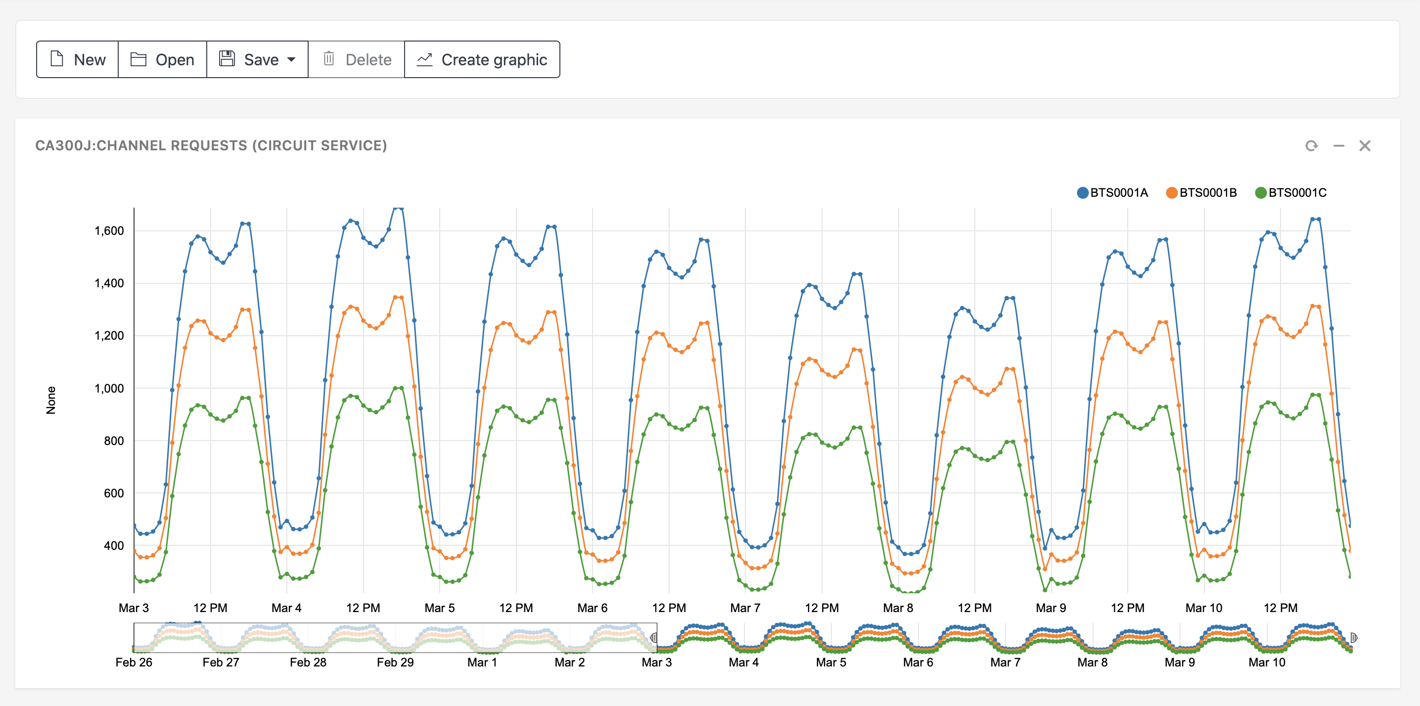
You can create custom graphics to check more KPIs than those automatically added in degradation cases for root cause analysis. Also, you can aggregate cells into clusters and check their performance. In addition, cells can be grouped according to various criteria, such as owner, city and state, in order to analyze or compare their performance.